Why the Bookshelf Color Palette Formula Changes Everything
If your bookshelves feel more cluttered than curated, you’re not alone. A mix of books, decor, and keepsakes can quickly look messy without a clear plan. That’s where the Bookshelf Color Palette Formula comes in—a simple but designer-approved approach that turns everyday shelves into balanced, intentional vignettes inspired by Emily Henderson’s styling secrets.
At the core of these foolproof methods are a few essential ground rules: keeping a consistent color palette, creating contrast through a Shape Size Mix, and using a thoughtful Greenery Inclusion Tip to add softness and life. Together, these principles help shelves feel cohesive rather than chaotic while supporting popular bookshelf styling ideas readers are already searching for.
In this guide, you’ll learn how to use the Bookshelf Color Palette Formula to bring visual balance, personality, and polish to any shelf size, along with practical book organization tips and easy styling variations you can apply right away.

Why a Consistent Bookshelf Color Palette Formula Matters
A shelf can quickly feel busy when every book spine, object, and accent competes for attention. That is why a Bookshelf Color Palette Formula is the starting point for polished styling. Keeping to a consistent color palette helps your shelves look cohesive, calm, and intentionally designed instead of random. Think soft neutrals, warm wood tones, and a few subtle accent colors to create balance without losing personality.
One simple trick is to pepper light and dark book spines evenly across the shelf so one area does not feel visually heavy. Avoid piling too many of the same colors together unless you are deliberately color-coding for a bold effect. For more balance inspiration, see this guide to using color ratios for balanced rooms.
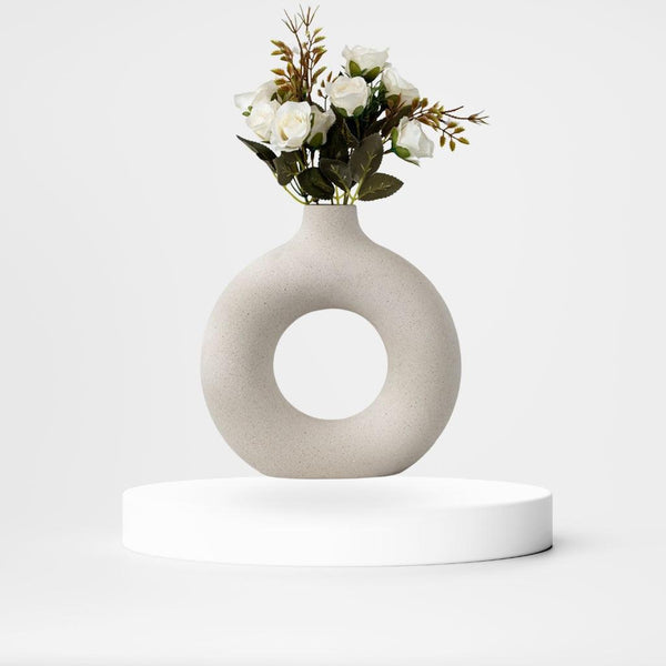
Strong styling also depends on a thoughtful Shape Size Mix. Pair taller pieces with shorter stacks to keep the eye moving naturally. Then use a smart Greenery Inclusion Tip, like adding a small trailing plant or potted succulent, to break up hard lines and bring in softness. Neutral tones with pops of greenery are among the most timeless bookshelf color palette ideas, and they create an easy modern-organic look.
These ground rules build the foundation for every beautifully styled shelf and set up the formulas that follow.
Master the Shape Size Mix for Dynamic Interest
A beautifully styled shelf rarely uses objects that all look the same. The key is a smart Shape Size Mix that blends different heights, widths, and visual weights. Start with the largest books or decorative pieces first, since they anchor the shelf and make it easier to build around them. From there, layer in smaller accents so the arrangement feels varied rather than flat or repetitive.
Varying heights is especially important. A tall vessel next to a short horizontal stack creates movement and helps the eye travel across the bookshelf. Mixing scales also keeps shelves from looking too uniform, which is one of the easiest ways to make styling feel more collected and less staged. If you want more inspiration for arranging objects in visually pleasing groups, explore these curated shelf styling groupings.
When paired with a Bookshelf Color Palette Formula, this mix of shapes and sizes feels intentional instead of cluttered. Add a subtle Greenery Inclusion Tip into open gaps, and the whole shelf gains softness, texture, and a more natural rhythm.
The Essential Greenery Inclusion Tip for Organic Life
Even the most balanced shelf can feel a little stiff without something living on it. A simple Greenery Inclusion Tip adds texture, color, and softness that books and hard accessories alone cannot provide. Small plants work especially well in the negative space between books, bowls, or stacked objects, where they help the shelf breathe instead of feeling overcrowded.
Try a trailing plant for gentle movement or a compact succulent for a clean, minimal touch. These additions are most effective when they support your Bookshelf Color Palette Formula, such as pairing green leaves with neutral spines, muted ceramics, and warm natural textures. This creates a fresh modern-organic vibe that still feels cohesive.
Greenery also strengthens your Shape Size Mix by introducing looser, softer forms between more structured objects. Used sparingly and placed with intention, plants bring shelves to life and complete the foundation for the styling formulas ahead.
Formula #1 and #2: Styling Books and Art with Purpose
Formula #1 starts with a simple but effective move: stack 2–3 books horizontally in ascending size, then place a decorative object on top, such as a lidded bowl or vintage vessel. This approach instantly supports your Bookshelf Color Palette Formula by giving each shelf a grounded focal point while keeping tones cohesive. It also strengthens the Shape Size Mix, since the low stack contrasts beautifully with a sculptural top piece.
To make Formula #1 feel even more polished, choose books and objects in palette-friendly shades and place a small plant or trailing stem nearby. That subtle Greenery Inclusion Tip softens the arrangement and fills negative space without adding clutter. It’s an easy way to create a styled, intentional look from ordinary books.
Formula #2 builds depth by leaning art at the back of the shelf and layering one to three objects in front. The art adds personality, while the varied objects create a collected effect that works especially well with a balanced Bookshelf Color Palette Formula. Mix heights and silhouettes to improve the Shape Size Mix, and use this setup to make even shallow or small shelves feel more dimensional and professionally styled.

Formula #4, Book Organization, and Pro Styling Fixes
Formula #4 is ideal when you want shelves to feel polished but still practical: place 3–5 books vertically, then flank them with sculptural bookends or decorative objects to create movement and structure. This approach works especially well with a Bookshelf Color Palette Formula, because it keeps larger book groupings cohesive while letting accent pieces add personality. For better visual rhythm, mix these vertical rows with a few horizontal stacks elsewhere on the shelf.
To keep the arrangement balanced, organize books by height first, with the tallest volumes often grounded on lower shelves, then refine by color so the overall palette feels intentional. This is where Shape Size Mix becomes essential: start with the biggest books, repeat groupings of two or more items, and leave breathing room for objects and negative space rather than filling every inch.
Avoid common mistakes like overcrowding with tiny accessories, relying on overly uniform colors, or skipping plants entirely. A simple Greenery Inclusion Tip is to tuck a small plant or trailing stem into open gaps to soften the arrangement and connect the whole shelf visually.

Conclusion
Creating beautifully styled shelves does not have to feel complicated. By following the Bookshelf Color Palette Formula, balancing every shelf with a thoughtful Shape Size Mix, and adding life through a smart Greenery Inclusion Tip, you can turn cluttered bookcases into polished, designer-worthy displays.
The biggest takeaway is simple: begin with the ground rules, then apply one styling formula per shelf to keep the overall look cohesive and intentional. This approach makes it easier to style with confidence, whether you are working with a bookshelf full of books, decorative objects, or a mix of both. Emily Henderson’s method proves that small adjustments in color, scale, and placement can create a major visual impact.
Now it is your turn to test these ideas on your own shelves, refine the layout, and share your results. If you want more inspiration, explore related searches like Emily Henderson bookshelf styling and continue building a look that feels curated, personal, and effortlessly balanced.
Source
Design Mistakes: Shelf Styling With Too Many Small Random Objects